The Omnivox Process – Preplanning
At the beginning of any project, a Graphic Designer must sketch out their ideas to create a solid framework to make the design. A year ago, when I started this project, I was starting to have a better sense of sketching. There was still some primally fuelled impatience that made me want to start immediately on the screen.
What I sketched were ideas for the basic page structure and required pages. My main idea was to try and recreate the aesthetic of Omnivox itself, from the common colors to Roboto. All pages inside were to have a line the spans both pages, both being a gradient with the top as orange and the bottom as blue.
The Omnivox Process – Onto The Screen
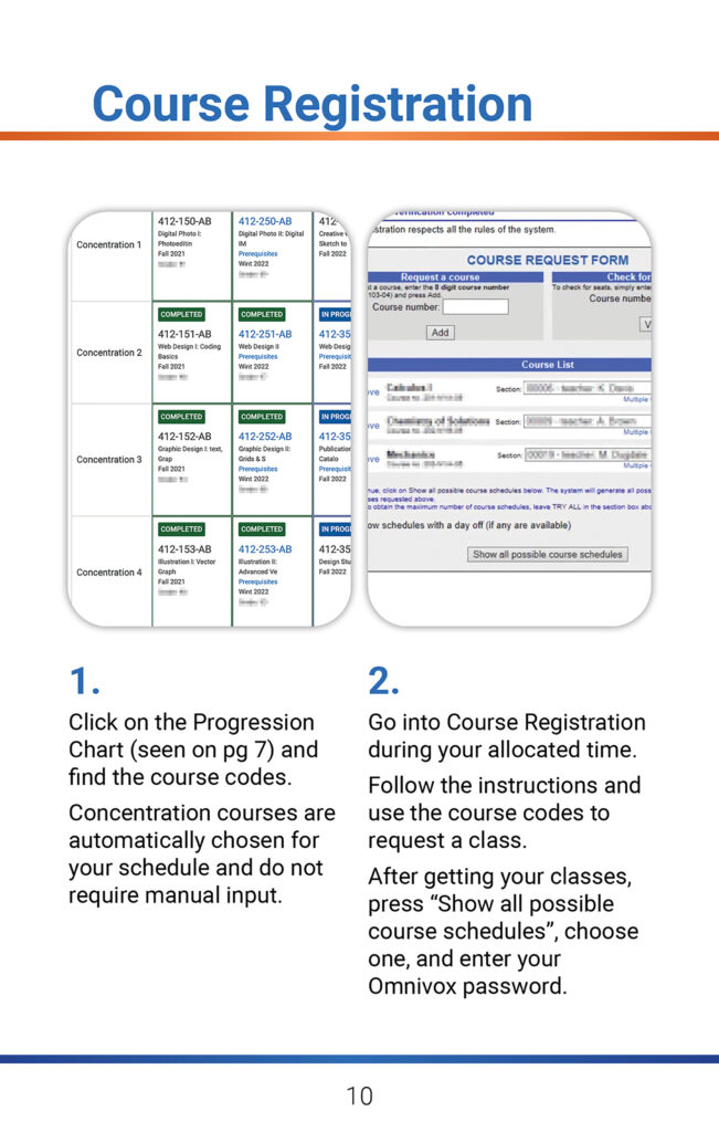
When making the pages, I had a goal to making the instructions easy to understand, because I felt that Omnivox was very threatening with all the buttons at first. Numbered steps, understandable but concise language, and imagery with pointers were needed to make it easy for the reader to learn how to use the service.
For the work, it was trying to dissect the original processes of Omnivox. This included course registration, proper labelling of the home page, and the quirk of assignment submission. I needed to go over those pages and their steps. The course code system, highlight the important parts of the first page of Omnivox.
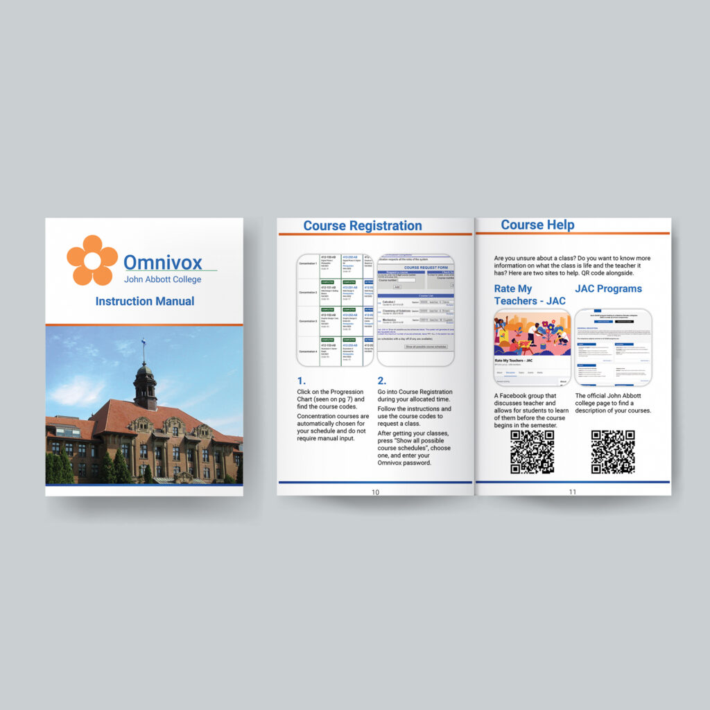
The class’s submission’s need of a zipped folder to ensure that assignments consisting of multiple are handed in properly. There was even a page that had QR codes, when they were scanned, they sent you to different sites. One was a Facebook group that rates teachers and the other an official page for descriptions of courses because I found that finding it was very hard.
Nearing the end, I realized that I needed to have a page count that was a multiple of 4 so it could be printed out properly. With the cover, back, and all pages of content, it landed me with 14 total pages. Booklets work in multiples of four, I had missed on that part. I had to add in two extras, so I added a full landscape shot of John Abbott to top it all off.
I felt and still feel that this instruction manual has been my best work up to date. It has a well thought out structure, clear subject matter, and a clean aesthetic that was easily readable.

