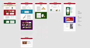
Since this was based on Branding work of Burrigo, I had to make it under the same aesthetic of my business, letterhead, and other print work. First, we had to make of mock-up of our site design. It was made with Adobe XD, a vector program catered towards the sharing of projects.
The site needed 5 static pages, consisting of 5 static pages being home, about services contact and blog. All pages except the contact and blog posts page needed to have 300 words written out for them. Three blog posts would also have to be written with 300 words across each. I am glad to say that I wrote all the pages without any help from AI programs like ChatGPT. This took a long time, but I feel like writing on my own helps give it all a personal touch.
Then came building the actual website for the class. It was all done on a server provided by the school, with a page dedicated in our own names to listing out the sites we needed to make. First was installing WordPress to host the editing tools. Personally, I find the regular means of editing on there to be very limiting and low-tech. A plugin called Classic Editor circumvents this and allows me to build my site with custom class names and have direct control over the HTML coding. Then there are the other plugins as prerequisites, some for security against nasty hackers and others to back up our site just in case a short circuit blows somewhere, and everything is wiped.
Then there is the last part of Web Design that I like to experiment with after all the HTML, classes, grids, menus, footers, etc. has been set up, CSS. CSS acts like a class sheet that tags, classes, and Ids refer to for what they look like. Many tags are available to be used to improve the general aesthetic of a site. Just with this site, I experiment with a “Transform: scale (1.1)” on the page links in the menus. Then this will increase the size of the text when hovering over with a mouse by 10%.
I feel that the website was a success and I wish to hopefully improve my skills in the future.

